How to Make a TikTok Carousel People Actually Swipe Through
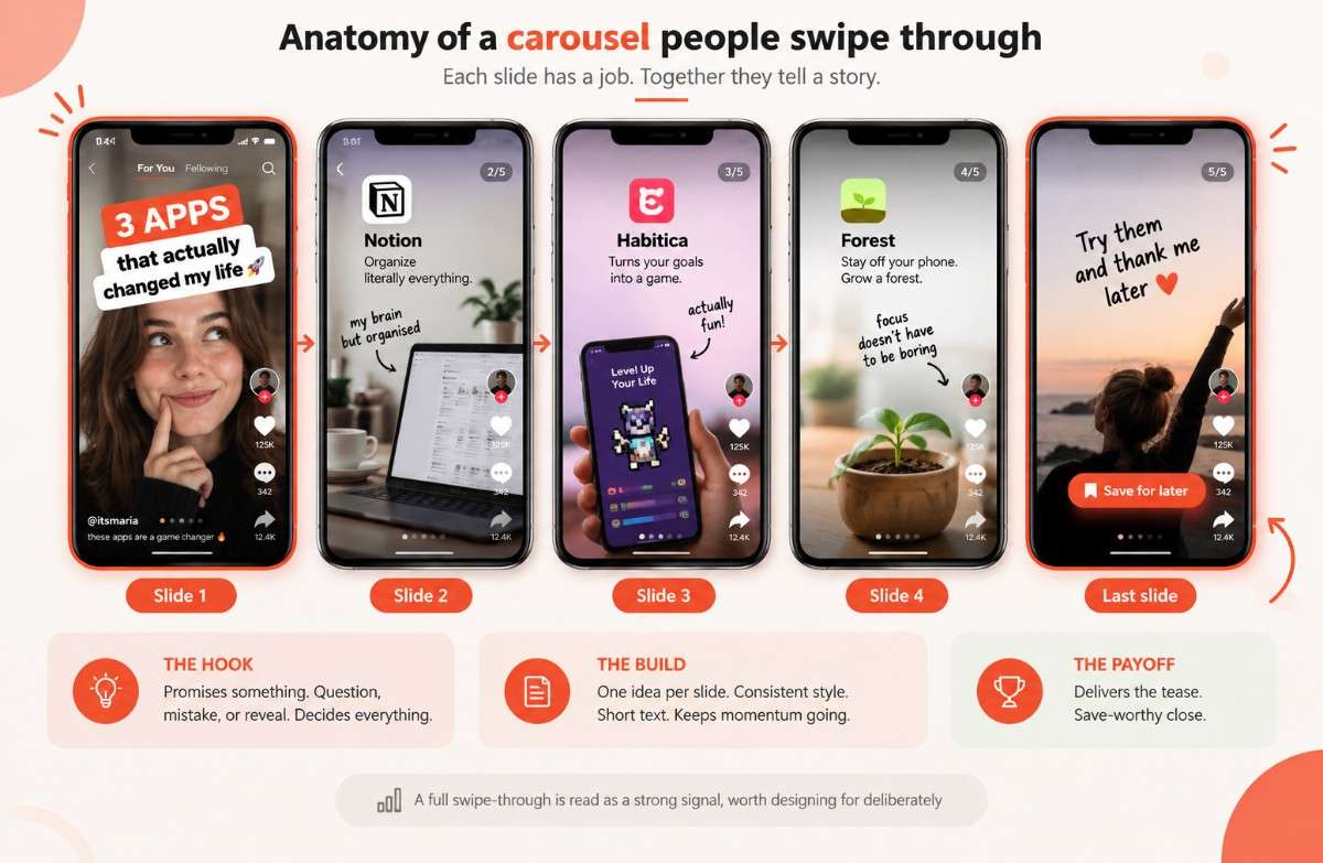
when the first slide creates a real reason to keep going, usually a question, a mistake, or a reveal, and every slide after it earns the next swipe instead of assuming it.

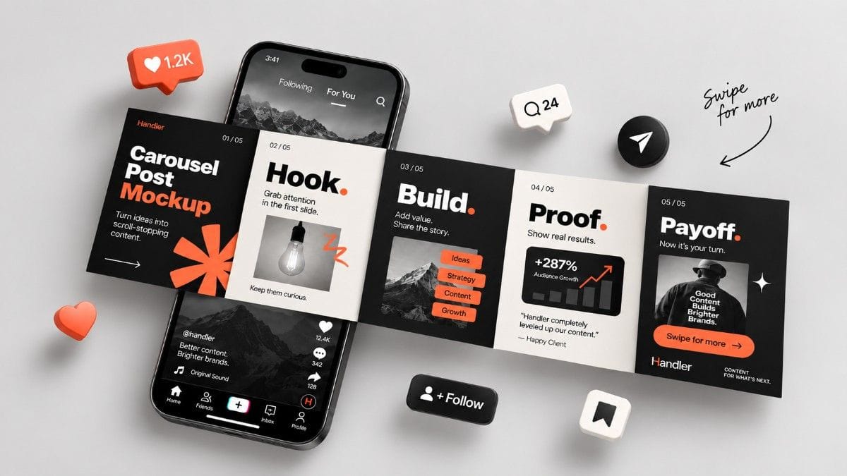
A TikTok carousel gets swiped through when the first slide creates a real reason to keep going, usually a question, a mistake, or a reveal, and every slide after it earns the next swipe instead of assuming it. TikTok's algorithm treats a full swipe-through as a strong signal, so design matters here in a way it does not on a single photo.
Updated September 2026
This is not a posting tutorial. If you need the actual mechanics, image sizing, how many slides TikTok allows, the exact steps to publish, How to Post a Slideshow on TikTok covers that piece by piece. This guide is about what separates a carousel nobody finishes from one people swipe all the way through.
Why swipe-through rate matters more than it looks like it should
Unlike a single photo or a video someone watches passively, a carousel asks for an active choice on every slide: keep swiping, or stop. TikTok appears to read a full swipe-through as a strong signal that the content is worth showing to more people, similar to how completion rate works for video. A carousel that gets abandoned after slide one sends the opposite signal, even if the photos themselves are genuinely good.
This is also a moment TikTok is actively rewarding. Photo Mode has been getting real algorithmic attention through 2026, with creators reporting carousels reaching non-followers at a rate their videos sometimes do not. None of that helps if nobody swipes past the first slide to begin with.
The first slide is the whole post
Every source on this format agrees on one thing: the first slide functions as a headline and a thumbnail at the same time, and viewers decide whether to keep going in about the time it takes to read this sentence. A bland or purely decorative first slide gets scrolled past before the actual content ever has a chance to land.
What tends to work is creating an open question the rest of the carousel answers. A bold claim, a specific number, a mistake called out by name, or a "wait for it" tease all do the same job: they promise something the viewer has to swipe to actually get. A slide that just states the topic, "5 tips for X," does none of that work on its own. If you are stuck on wording a hook like this, Handler's AI TikTok Hook Generator is built for exactly this kind of line.
Three slide structures that consistently work
Most high-performing carousels fall into one of a handful of repeatable shapes rather than something invented from scratch each time.
- Mistake, then fix. Slide one shows a common mistake, the following slides show the correct way to do it. People swipe to check whether they are doing it right themselves.
- The list. "My top 5" or "3 things nobody tells you" style posts. Easy to plan ahead of time, and the format itself invites a save for later, which is its own strong signal to the algorithm.
- Tease, then reveal. Open with a messy or incomplete state, close with the payoff on the last slide. The gap between the two is what pulls people through everything in between.
None of these need to be clever. They just need a genuine reason for slide two to exist once someone has already seen slide one.
Keeping momentum through the middle slides
Once someone swipes past slide one, the job shifts from hooking them to not losing them, and a few small choices are responsible for most of the drop-off here.
- One idea per slide. Crowding two points onto a single image gives people a reason to stop reading and swipe away before either point lands.
- A consistent visual style, same filter, same font, same layout, across every slide. Inconsistency reads as several posts stitched together rather than one carousel with a single idea.
- Text short enough to read in a couple of seconds, since slides auto-advance on their own timer even if someone does not manually swipe.
- A small "swipe" cue on the first slide or two removes any doubt about whether there is more to see, which matters more than it sounds like it should.
The last slide is the payoff, do not waste it
The last slide carries more weight than most people give it. It is where the tease from slide one actually pays off, and it is also the natural place for a save-worthy takeaway or a light call to action, follow for more, try this yourself, go download the thing. A carousel that trails off without a clear final beat wastes everything the earlier slides spent building up. Treat the last slide with the same care as the first, since it is the one people remember on their way back out of the post.
The anatomy of a carousel that converts
Building it without starting from a blank slide
If you already know the shape you want, whether that is mistake-then-fix or tease-then-reveal, Handler's AI TikTok Slideshow Generator can put the actual slides together for you, sized and formatted correctly from the start. And if you want to see real examples of what is already working before you build your own version of it, The VSC Framework: How We Validate TikTok Ideas Before Building covers how we pick proven ideas worth modeling instead of guessing.
Quick answers
What makes a TikTok carousel get more swipes? A strong, curiosity-driven first slide is the biggest factor by far. It needs to promise something, a mistake, a reveal, a useful list, that the viewer has to keep swiping to actually get.
Does TikTok reward carousels that get swiped all the way through? It appears to. A full swipe-through is treated as a strong engagement signal, similar to watch-through rate on video, which can help the post reach more people beyond your existing followers.
How many slides should a TikTok carousel have? Enough to deliver on what the first slide promised and no more. Most well-performing carousels land in the 5 to 10 slide range, long enough to tell a complete story without losing people halfway through.
Do TikTok carousels need to be branded or consistent looking? Consistency helps more than heavy branding does. A shared filter, font, or layout across every slide reads as intentional and professional, while a small logo or color accent is usually enough branding on its own.